16 KiB
16 KiB
aliases, atlas, created, modified, tags, title
| aliases | atlas | created | modified | tags | title |
|---|---|---|---|---|---|
| Atlas/Card | 2024-03-15 21:36:51 | 2024-03-16 18:39:20 | 数据处理过程 |
数据清洗
通过编写 Python 代码将对接人所提供的所有业务明细单整合为一个文件以便后续数据分析的进行
import os
import pandas as pd

# The directory containing your Excel files
directory = 'E:/Projects/analyse'

# List to hold data from each file
all_data = []

# Loop through each file in the directory
for filename in os.listdir(directory):
    if filename.endswith('.xlsx') or filename.endswith('.xls'):
        file_path = os.path.join(directory, filename)
        df = pd.read_excel(file_path)
        all_data.append(df)

# Concatenate all data into a single DataFrame
merged_data = pd.concat(all_data, ignore_index=True)

# Save the merged DataFrame to a new Excel file
merged_data.to_excel('merged_data.xlsx', index=False)

print("Files have been merged and saved as 'merged_data.xlsx'")
删去了以下列:序号、服务单号、调度单号、联系人、联系电话、患者信息、销售、介绍人、客服、调度、来源、承包组、车牌、出车成员、医护出车和任务备注
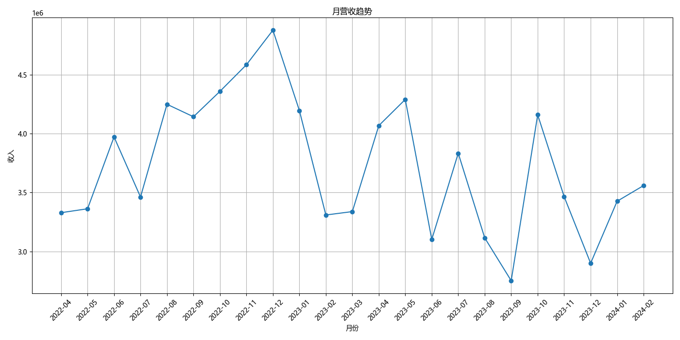
经过确认,所有调度单状态不为已返回的订单均未产生收入,故将其全部筛选出来后将总成交价一列的数值改为 0 以免影响计算结果,统计后月营收额如下所示:
| 日期 | 2022-04 | 2022-05 | 2022-06 | 2022-07 | 2022-08 | 2022-09 | 2022-10 | 2022-11 | 2022-12 | 2023-01 | 2023-02 | 2023-03 | 2023-04 | 2023-05 | 2023-06 | 2023-07 | 2023-08 | 2023-09 | 2023-10 | 2023-11 | 2023-12 | 2024-01 | 2024-02 |
|---|---|---|---|---|---|---|---|---|---|---|---|---|---|---|---|---|---|---|---|---|---|---|---|
| 营收额 | 3328917.00 | 3362286.00 | 3973152.00 | 3462363.00 | 4250864.00 | 4144810.76 | 4360712.00 | 4587020.00 | 4880988.50 | 4197830.00 | 3309294.00 | 3338335.00 | 4069565.00 | 4292058.60 | 3101339.20 | 3834394.40 | 3114722.80 | 2750602.00 | 4161377.40 | 3465051.00 | 2898861.00 | 3426260.50 | 3559553.15 |
数据分析
月营收趋势
import pandas as pd
import matplotlib.pyplot as plt
plt.rcParams['font.sans-serif'] = ['Microsoft YaHei']

# Load the Excel file
data = pd.read_excel('E:/Projects/analyse/pythonProject/merged_data.xlsx')

# Convert '日期' to datetime format and '总成交价' to numeric
data['日期'] = pd.to_datetime(data['日期'])
data['总成交价'] = pd.to_numeric(data['总成交价'], errors='coerce')

# Add a column for the year and month for easier analysis
data['YearMonth'] = data['日期'].dt.to_period('M')

# Summarize monthly revenue
monthly_revenue = data.groupby('YearMonth')['总成交价'].sum().reset_index()

plt.figure(figsize=(14, 7))
plt.plot(monthly_revenue['YearMonth'].astype(str), monthly_revenue['总成交价'], marker='o')
plt.title('月营收趋势')
plt.xlabel('月份')
plt.ylabel('收入')
plt.xticks(rotation=45)
plt.grid(visible=True)
plt.tight_layout()
plt.show()
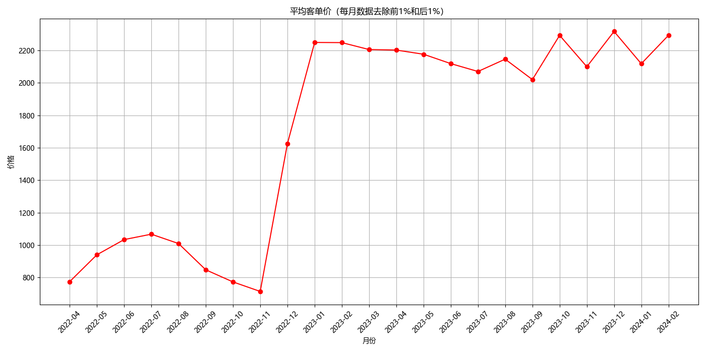
平均客单价
# Attempting the analysis again with additional checks
import pandas as pd
import matplotlib.pyplot as plt
plt.rcParams['font.sans-serif'] = ['Microsoft YaHei']

# Load the Excel file
data = pd.read_excel('E:/Projects/analyse/pythonProject/merged_data.xlsx')

# Ensure '日期' is in datetime format for grouping
data['日期'] = pd.to_datetime(data['日期'])

# Add a 'YearMonth' column for easier analysis
data['YearMonth'] = data['日期'].dt.to_period('M')

# Group data by 'YearMonth'
grouped = data.groupby('YearMonth')


# Function to remove the top 1% and bottom 1% within each group
def remove_outliers(group):
    lower = group['总成交价'].quantile(0.01)
    upper = group['总成交价'].quantile(0.99)
    return group[(group['总成交价'] > lower) & (group['总成交价'] < upper)]


# Apply the function to each group
filtered_groups = grouped.apply(remove_outliers)

# Reset index as the grouping operation might introduce a multi-level index
filtered_groups = filtered_groups.reset_index(drop=True)

# Group by 'YearMonth' again after filtering and calculate the average price
average_price_filtered = filtered_groups.groupby('YearMonth')['总成交价'].mean().reset_index()

# Convert 'YearMonth' to string for plotting
average_price_filtered['YearMonth'] = average_price_filtered['YearMonth'].astype(str)

# Plotting the result
plt.figure(figsize=(14, 7))
plt.plot(average_price_filtered['YearMonth'], average_price_filtered['总成交价'], marker='o', linestyle='-',
         color='red')
plt.title('平均客单价(每月数据去除前1%和后1%)')
plt.xlabel('月份')
plt.ylabel('价格')
plt.xticks(rotation=45)
plt.grid(visible=True)
plt.tight_layout()
plt.show()
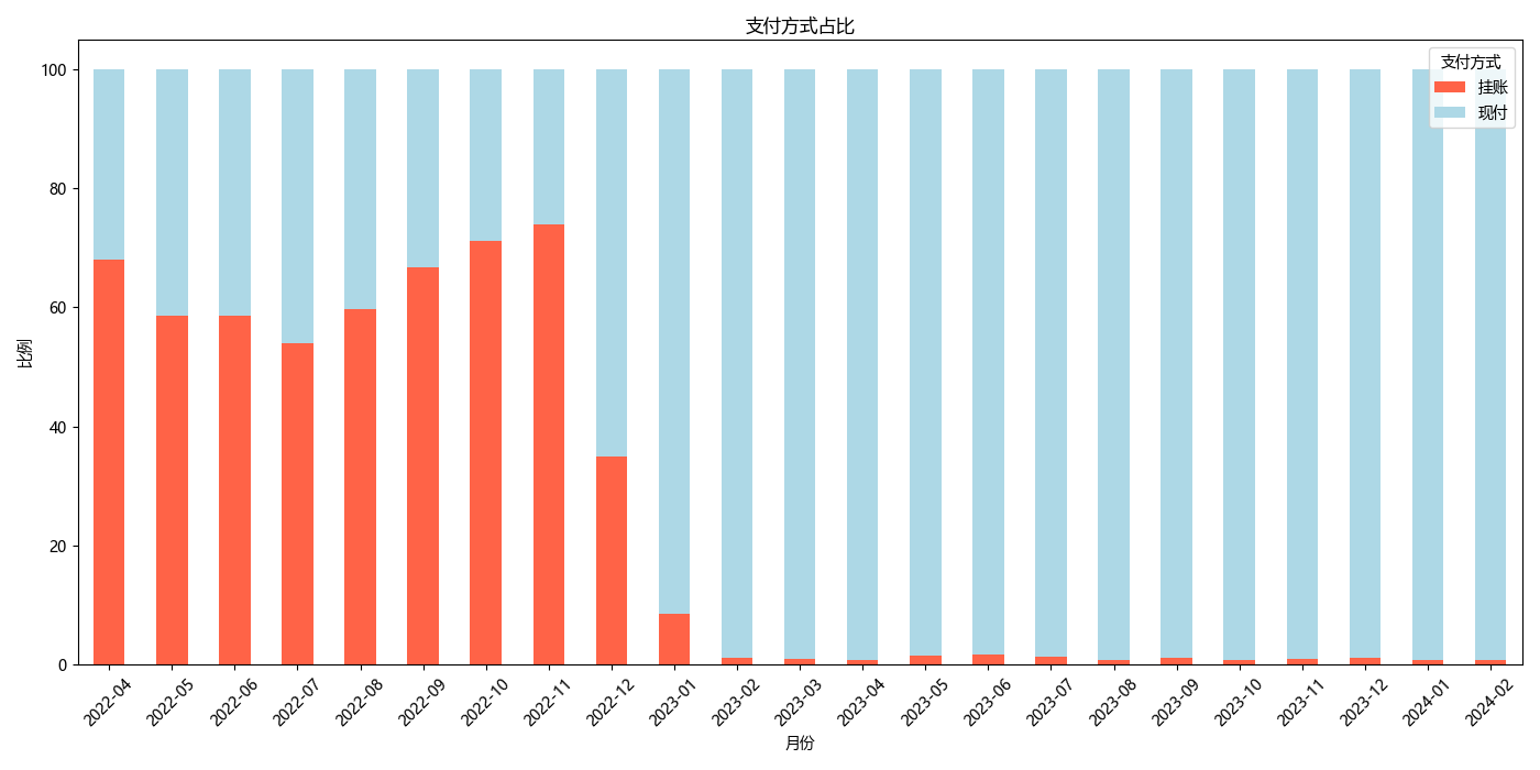
支付方式统计
import pandas as pd
import matplotlib.pyplot as plt
plt.rcParams['font.sans-serif'] = ['Microsoft YaHei']

# Load the Excel file
data = pd.read_excel('E:/Projects/analyse/pythonProject/merged_data.xlsx')

# Ensure '日期' is in datetime format for grouping
data['日期'] = pd.to_datetime(data['日期'])

# Add a 'YearMonth' column for easier analysis
data['YearMonth'] = data['日期'].dt.to_period('M')

# Assuming 'data' is your DataFrame and '支付方式' is the column for Payment Methods
data['Payment Category'] = data['支付方式'].apply(lambda x: '挂账' if '挂账' in str(x).lower() else '现付')

# Group by 'YearMonth' and 'Payment Category', then count the occurrences
monthly_payment_category_counts = data.groupby(['YearMonth', 'Payment Category']).size().unstack(fill_value=0)

# Calculate the percentage of 'Pending' and 'Other' categories for each month
monthly_payment_category_percentage = (monthly_payment_category_counts.div(monthly_payment_category_counts.sum(axis=1), axis=0) * 100)

# Plotting the results - A stacked bar chart would be suitable to show percentages month-by-month
monthly_payment_category_percentage.plot(kind='bar', stacked=True, figsize=(14, 7), color=['tomato', 'lightblue'])
plt.title('支付方式占比')
plt.xlabel('月份')
plt.ylabel('比例')
plt.legend(title='支付方式')
plt.xticks(rotation=45)
plt.tight_layout()
plt.show()
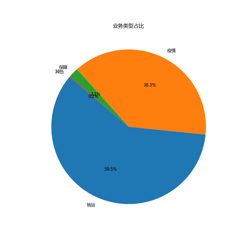
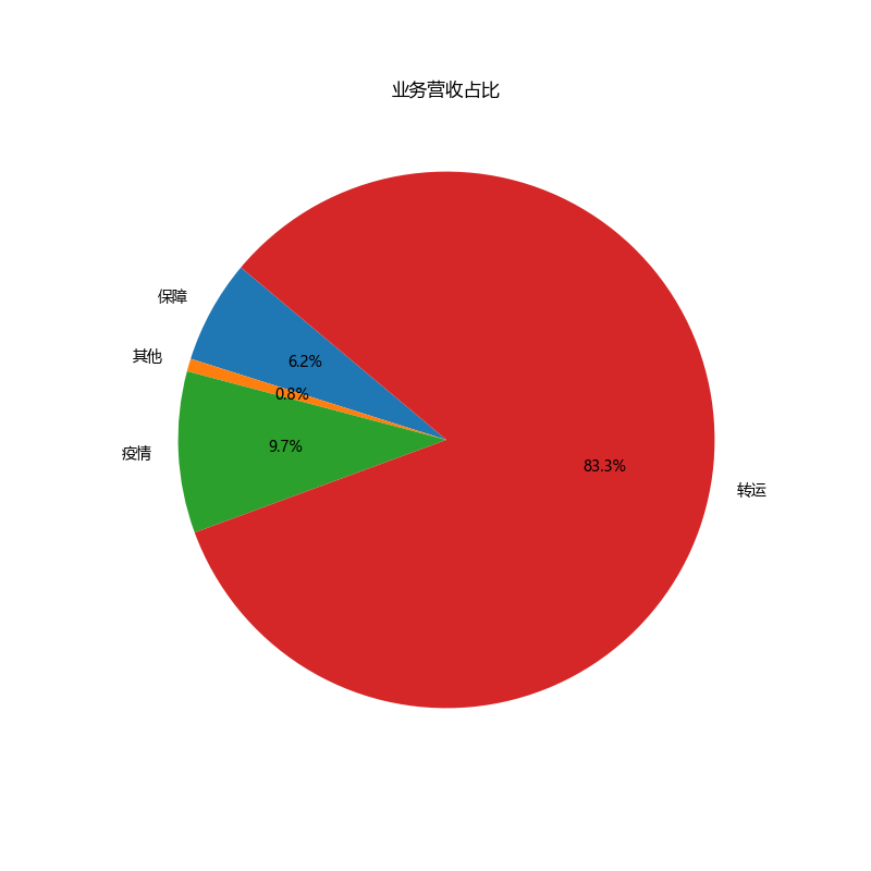
业务类型占比
import pandas as pd
import matplotlib.pyplot as plt

plt.rcParams['font.sans-serif'] = ['Microsoft YaHei']

# Load the Excel file
data = pd.read_excel('E:/Projects/analyse/pythonProject/merged_data.xlsx')


# Define the categorization function based on the provided criteria
def categorize_business_type(x):
    if any(keyword in x for keyword in ['保障转运', '密接', '回城', '发热', '送样', '民政任务']):
        return '疫情'
    elif any(keyword in x for keyword in ['高铁', '航空', '机场', '救护车']):
        return '转运'
    elif '保障' in x:
        return '保障'
    else:
        return '其他'


# Apply the categorization function to the '类型' column to create a new 'Business Category' column
data['Business Category'] = data['类型'].apply(categorize_business_type)

# Calculate the percentage of business for each category
business_percentage = data['Business Category'].value_counts(normalize=True) * 100

# Calculate the revenue share for each business category
revenue_share = data.groupby('Business Category')['总成交价'].sum()
revenue_share_percentage = (revenue_share / revenue_share.sum()) * 100

# Plotting the business percentage pie chart
plt.figure(figsize=(8, 8))
plt.pie(business_percentage, labels=business_percentage.index, autopct='%1.1f%%', startangle=140)
plt.title('业务类型占比')
plt.show()

# Plotting the revenue share percentage pie chart
plt.figure(figsize=(8, 8))
plt.pie(revenue_share_percentage, labels=revenue_share_percentage.index, autopct='%1.1f%%', startangle=140)
plt.title('业务营收占比')
plt.show()
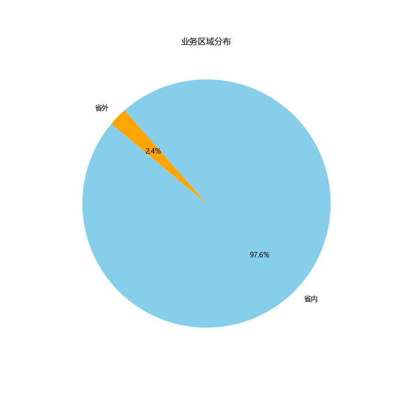
业务区域分布
import pandas as pd
import matplotlib.pyplot as plt
plt.rcParams['font.sans-serif'] = ['Microsoft YaHei']
# Load the Excel file
data = pd.read_excel('E:/Projects/analyse/pythonProject/merged_data.xlsx')
# Correcting the approach based on the updated description for the '区域' column
# Update the DataFrame to reflect the correct column name and values for categorization
data['Regional Category'] = data['区域'].map({'市内': '省内', '广东省内': '省内', '国际': '省外', '港澳台': '省外', '广东省外': '省外'})
# Calculate the distribution of the new categories
regional_category_distribution = data['Regional Category'].value_counts()
# Generate a pie chart to show the updated regional distribution of the business
plt.figure(figsize=(8, 8))
plt.pie(regional_category_distribution, labels=regional_category_distribution.index, autopct='%1.1f%%', startangle=140, colors=['skyblue', 'orange'])
plt.title('业务区域分布')
plt.show()
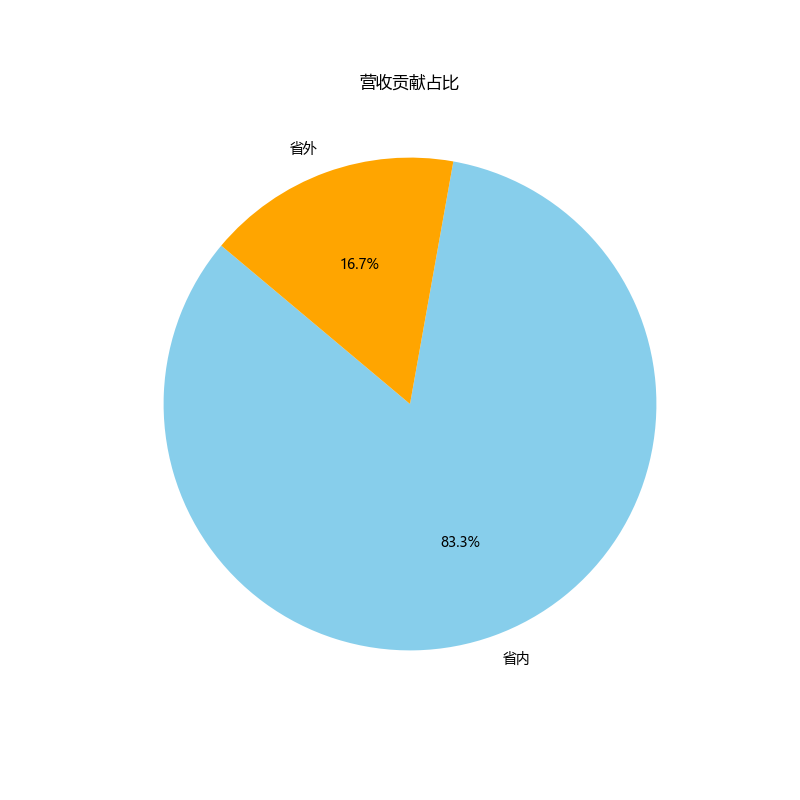
# Next, group by the new regional category and sum the revenues
revenue_by_category = data.groupby('Regional Category')['总成交价'].sum()
# For the pie chart, we can directly use the revenue_by_category Series
# The index of this Series will be the labels, and the values will be the sizes for each pie slice
plt.figure(figsize=(8, 8))
plt.pie(revenue_by_category, labels=revenue_by_category.index, autopct='%1.1f%%', startangle=140, colors=['skyblue', 'orange'])
plt.title('营收贡献占比')
plt.show()
业务时段分布
import pandas as pd
import matplotlib.pyplot as plt
plt.rcParams['font.sans-serif'] = ['Microsoft YaHei']
# Load the Excel file
data = pd.read_excel('E:/Projects/analyse/pythonProject/merged_data.xlsx')
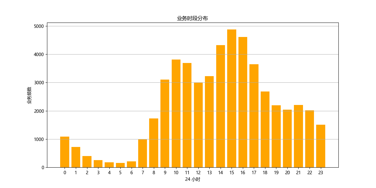
# Extracting hour from the '时间' column to analyze service demand by time of day
data['Hour'] = data['时间'].str.extract('(\d+):').astype(int)
# Analyzing service demand by hour
service_demand_by_hour = data.groupby('Hour')['日期'].count().reset_index()
# Plotting service demand by hour
plt.figure(figsize=(12, 6))
plt.bar(service_demand_by_hour['Hour'], service_demand_by_hour['日期'], color='orange')
plt.title('业务时段分布')
plt.xlabel('24 小时')
plt.ylabel('业务频次')
plt.xticks(range(0, 24))
plt.grid(axis='y')
plt.show()
白班夜班比例
import pandas as pd
import matplotlib.pyplot as plt
plt.rcParams['font.sans-serif'] = ['Microsoft YaHei']
# Load the Excel file
data = pd.read_excel('E:/Projects/analyse/pythonProject/merged_data.xlsx')
# Ensure '日期' is in datetime format for grouping
data['日期'] = pd.to_datetime(data['日期'])
# Add a 'YearMonth' column for easier analysis
data['YearMonth'] = data['日期'].dt.to_period('M')
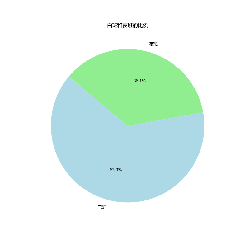
# Calculate the ratio of day and night shifts
shift_ratio = data['班次'].value_counts()
# Generate a pie chart to show the ratio of day and night shifts
plt.figure(figsize=(8, 8))
plt.pie(shift_ratio, labels=shift_ratio.index, autopct='%1.1f%%', startangle=140, colors=['lightblue', 'lightgreen'])
plt.title('白班和夜班的比例')
plt.show()
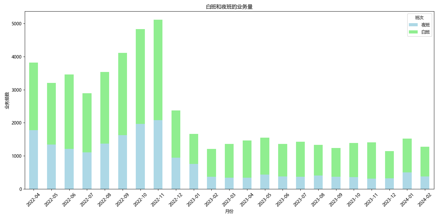
# Calculate the volume of day and night shifts by month
shift_volume_by_month = data.groupby(['YearMonth', '班次'])['日期'].count().unstack(fill_value=0)
# Generate a bar chart to show the volume of day and night shifts by month
shift_volume_by_month.plot(kind='bar', stacked=True, figsize=(14, 7), color=['lightblue', 'lightgreen'])
plt.title('Volume of Day and Night Shifts by Month')
plt.xlabel('Year-Month')
plt.ylabel('Number of Shifts')
plt.xticks(rotation=45)
plt.legend(title='Shift')
plt.tight_layout()
plt.show()
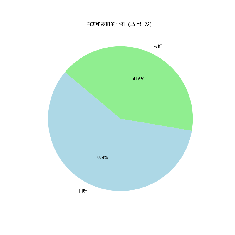
# Filter out booked departures to focus on immediate departures only
immediate_departures = data[data['预约类型'] == '马上出发']
# Calculating the ratio of day and night shifts for immediate departures only
immediate_departures_shift_ratio = immediate_departures['班次'].value_counts()
# Generate a pie chart to show the ratio of day and night shifts for immediate departures
plt.figure(figsize=(8, 8))
plt.pie(immediate_departures_shift_ratio, labels=immediate_departures_shift_ratio.index, autopct='%1.1f%%', startangle=140, colors=['lightblue', 'lightgreen'])
plt.title('白班和夜班的比例(马上出发)')
plt.show()
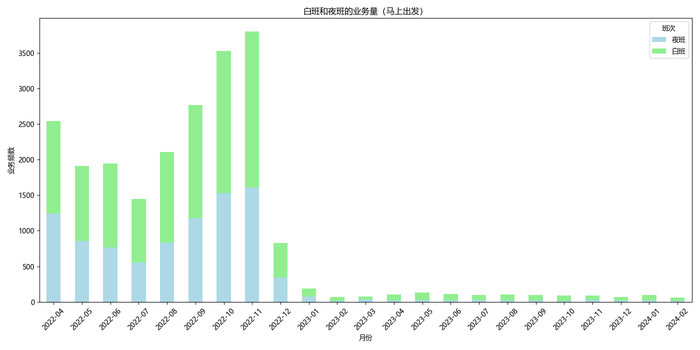
# Grouping immediate departures by 'YearMonth' and '班次' (Shift), then count the occurrences
immediate_departures_count_by_month_shift = immediate_departures.groupby(['YearMonth', '班次']).size().unstack(fill_value=0)
# Plotting the distribution of immediate departures by month and shift
immediate_departures_count_by_month_shift.plot(kind='bar', stacked=True, figsize=(14, 7), color=['lightblue', 'lightgreen'])
plt.title('白班和夜班的业务量(马上出发)')
plt.xlabel('月份')
plt.ylabel('业务频数')
plt.legend(title='班次', loc='upper right')
plt.xticks(rotation=45)
plt.tight_layout()
plt.show()
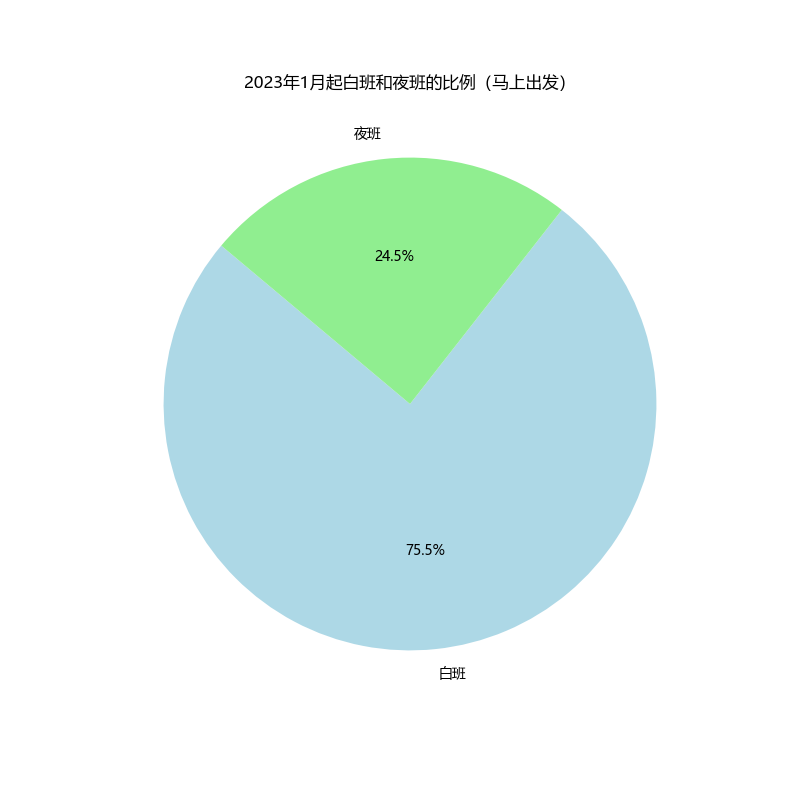
# Filter for immediate departures after December 2022
immediate_departures_after_dec2022 = immediate_departures[immediate_departures['YearMonth'] > '2022-12']
# Calculate the ratio of day and night shifts for this filtered data
shift_ratio_after_dec2022 = immediate_departures_after_dec2022['班次'].value_counts()
# Generate a pie chart to show the ratio of day and night shifts for immediate departures after December 2022
plt.figure(figsize=(8, 8))
plt.pie(shift_ratio_after_dec2022, labels=shift_ratio_after_dec2022.index, autopct='%1.1f%%', startangle=140, colors=['lightblue', 'lightgreen'])
plt.title('2023年1月起白班和夜班的比例(马上出发)')
plt.show()
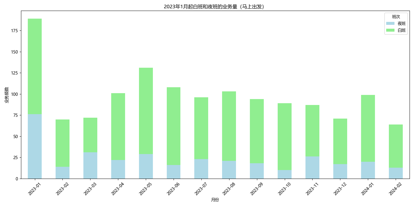
# Grouping immediate departures by 'YearMonth' and '班次' (Shift), then count the occurrences
immediate_departures_count_by_month_shift = immediate_departures_after_dec2022.groupby(['YearMonth', '班次']).size().unstack(fill_value=0)
# Plotting the distribution of immediate departures by month and shift
immediate_departures_count_by_month_shift.plot(kind='bar', stacked=True, figsize=(14, 7), color=['lightblue', 'lightgreen'])
plt.title('2023年1月起白班和夜班的业务量(马上出发)')
plt.xlabel('月份')
plt.ylabel('业务频数')
plt.legend(title='班次', loc='upper right')
plt.xticks(rotation=45)
plt.tight_layout()
plt.show()